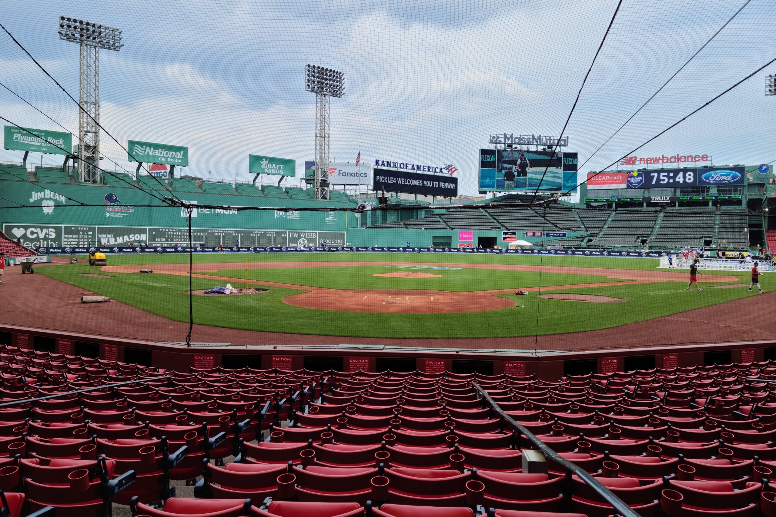
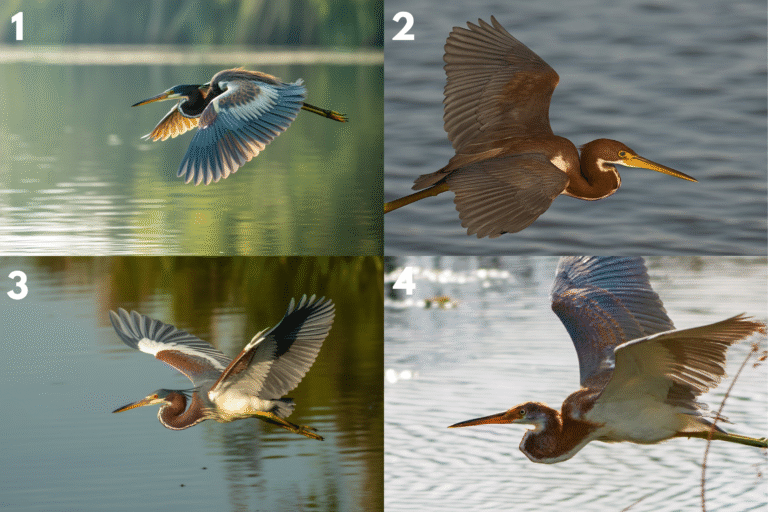
Only one is real. I know this because I took it myself.
My photo is of historic Fenway Park, home of the Boston Red Sox.
The other images are AI-generated. I created them using Ideogram.ai and ChatGPT.
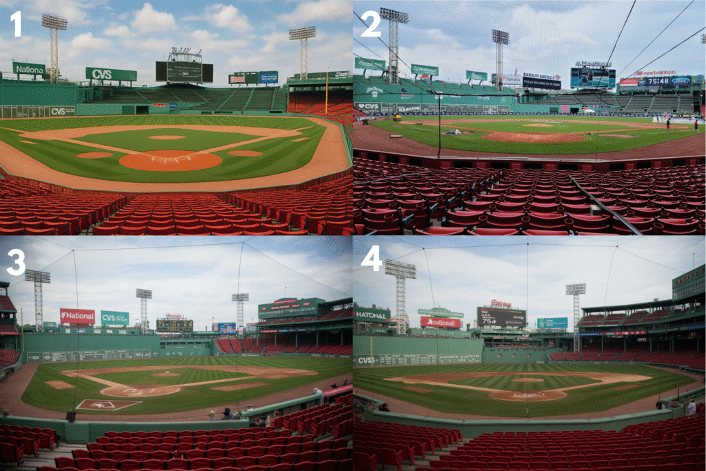
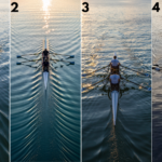
Which one do you think is the real image? See the answer below!
The real image of Fenway Park is:
Image #2
METADATA-START
Some clues that give away the AI images:
⚾ 1. Field and Turf Details
#2 (REAL):
The grass shows natural variation: some patches are slightly darker, and there are faint mowing lines, exactly what you’d expect on a real field.
The dirt around the mound and bases is uneven, with small scuffs and footprints visible — subtle signs of real-world use.
Shadows fall realistically where the infield meets the grass, adding depth and dimension.
AI (Images #1, #3, #4):
#1 has turf that looks painted-on, with perfectly smooth texture and overly saturated greens — too pristine to be real.
#3’s grass is oddly flat and lacks micro-shadows, giving it an artificial, “pasted” feel.
#4 shows suspiciously clean edges where dirt meets grass, with no small inconsistencies or wear patterns.
🏟 2. Seats and Structural Imperfections
#2:
The red seats have slight differences in color and shine due to natural lighting — exactly what happens in real-life stadium shots.
There’s a protective net in front of the camera, and its subtle tension lines and slight curvature are perfectly consistent with how real netting looks in photos.
Railings, poles, and aisle breaks are uneven in tiny ways, which AI often fails to replicate.
AI:
#1’s seats are too uniform, with identical highlights and no visible wear — a giveaway of generated imagery.
#3’s protective netting is unnaturally straight and lacks depth, more like a texture overlay than an actual object.
#4 has “clone-stamped” seat patterns where entire rows look identical.
📸 3. Lighting and Atmosphere
#2:
Lighting is naturally diffused, with believable shadows under seats and on the grass.
The sky has slight cloud variation, and distant stadium structures soften naturally, just like a real lens would capture.
There’s a mild atmospheric haze near the back rows, which helps the image feel grounded and authentic.
AI:
#1 uses uniform, studio-like lighting, giving the field a flat, hyper-clean look.
#3 has mismatched highlights on the scoreboard and the stands, inconsistent with the sun’s position.
#4’s lighting looks artificially even across all surfaces, from grass to seats, breaking realism.
🪧 4. Scoreboard and Branding Accuracy
#2:
The scoreboard text and sponsor logos are sharp and correctly scaled, matching Fenway Park’s real-world signage.
Farther billboards remain readable but slightly softened by distance blur, exactly how a camera would capture them.
AI:
#4 has overly perfect, almost glowing signage that looks rendered rather than photographed.
#1 shows logos that are overly crisp and vibrant, detached from the photo’s overall depth of field.
#3 features warped scoreboard details where AI struggled to align text on angled surfaces.
Tour Historic Fenway Park
Fenway Park is about more than just the Green Monster (Monstah?). Take a tour of this historic ballpark in this short video.
More From the Senior Tech Cafe ‘Real or AI?’ Challenge